
Coastal vs Nautical Wall Art: Which Style Fits Your Beach Home?

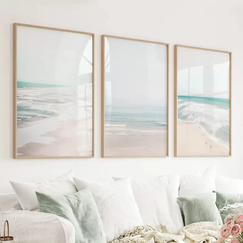
Understanding Coastal vs Nautical Wall Art
Coastal wall art emphasizes soft, organic beach elements like sand and shells, while nautical artwork leans into maritime symbols such as anchors and ropes. Both styles evoke the ocean, but they create very different moods in your beach home. Knowing which aesthetic matches your space helps you choose coastal wall art or nautical artwork for wall that feels cohesive rather than cluttered.
We tested dozens of prints and frame combinations in real beach homes to see which styles worked in living rooms, bedrooms, and hallways. The distinction matters because mixing the two without intention often creates visual noise. This guide walks you through the core differences, color palettes, room-by-room placement, and how to decide which style suits your home.
Key Differences in Theme and Imagery
Coastal designs pull from the natural shoreline: driftwood, seagrass, weathered pier posts, and subtle wave textures. You will see muted photography of empty beaches, watercolor seascapes, and abstract interpretations of tides. Beach wall art typically skips bold symbols in favor of texture and light.
Nautical artwork celebrates seafaring tradition. Expect compass roses, ship wheels, vintage maps, sailboats, and lifesaver rings. The imagery is more structured and graphic, often featuring crisp lines and recognizable icons. If you want a preppy, New England yacht-club vibe, nautical artwork for wall delivers that instantly.
| Style | Common Motifs | Mood |
|---|---|---|
| Coastal | Shells, sand, driftwood, horizons | Relaxed, organic, spa-like |
| Nautical | Anchors, ropes, ships, compasses | Crisp, traditional, maritime |
Both work beautifully in beach homes, but coastal feels more laid-back while nautical reads as intentionally classic. You can browse examples of each approach at Coastal Wall Art & Canvas Prints to see the spectrum.
Color Palettes: Soft Neutrals vs Bold Navy
Unique coastal wall art sticks to sand, ivory, pale blue, soft gray, and washed-out greens. The goal is to mimic sunlight on a quiet beach, so saturation stays low. Even when the subject is a crashing wave, the palette remains gentle. This makes coastal pieces easy to layer with white furniture and linen textiles.
Nautical palettes anchor around navy, crisp white, and red accents. You will see bolder contrast and cleaner color blocking. Stripes are common, and the overall effect is more graphic. If your decor already includes navy cushions or a striped rug, nautical prints reinforce that theme without competing.
We recommend choosing one dominant palette per room. A living room filled with soft coastal tones can handle one nautical accent piece, but swapping between palettes on every wall dilutes both styles. For current pricing on multi-piece sets that lock in a single palette, check the latest price.
Choosing the Right Size and Configuration
Large coastal wall art works best above a sofa or bed where you want a single focal point. Oversized prints of empty shorelines or abstract ocean textures fill the space without demanding too much attention. A single 40×60-inch canvas in soft grays anchors a neutral room beautifully.
Multi-panel sets create rhythm and work well in hallways or above console tables. A 3 piece wall art arrangement in coastal tones breaks up a long wall without overwhelming it. We found that three horizontal panels spaced four inches apart feel more intentional than a cluster of small frames.
For nautical rooms, smaller frames grouped in a gallery wall suit the graphic nature of the imagery. Mixing a vintage map print with a ship wheel illustration and a rope knot diagram builds a collected look. A coastal wall art set of 3 in matching frames keeps the arrangement tidy if you prefer symmetry over eclecticism.
Modern coastal wall art often arrives as a triptych or diptych, pre-coordinated to hang as a single composition. This simplifies installation and guarantees visual harmony. If you are ordering three piece wall art, measure your wall span first: the total width including gaps should take up roughly two-thirds of the furniture width below it.
Room-by-Room Placement for Beach Homes
Living room: Coastal works well here because the soft palette keeps the space open and airy. Hang a large horizontal print above the sofa or create a coastal wall art for living room gallery with four to six medium frames in a grid. Avoid nautical's bold navy if your upholstery is already dark; the room will feel heavy.
Bedroom: Either style succeeds in bedrooms, but coastal promotes calm. A serene seascape or abstract art prints in pale blue and sand tones reinforces a restful mood. Nautical can work in a kid's room or guest room where you want personality without needing the space to feel spa-like.
Hallway and entryway: Nautical thrives in narrow spaces where its graphic punch makes an immediate statement. A vertical trio of small nautical prints guides the eye down a hallway. Coastal pieces risk disappearing in dim corridors unless you add picture lighting.
Bathroom: Coastal is the safer choice. Nautical's bold colors can clash with tile and fixtures, while soft coastal tones blend with most bathroom palettes. A single framed print of sea grass or shells above the toilet adds interest without competing with mirror reflections.
You can explore sizing options and configurations at Large Coastal Art - Canvas Prints & Wall Art to see how scale changes the impact in different rooms.
Mixing Styles Without Creating Chaos
If you love both aesthetics, designate one as your primary style and use the other as a subtle accent. A coastal living room can handle one small nautical piece on a bookshelf, treated as a collected object rather than wall art. The reverse works too: a nautical den gains warmth from a single vintage coastal wall art photograph on a side wall.
Texture bridges the gap. A rope-wrapped frame on a coastal print or a driftwood frame on a nautical map borrows from both worlds without clashing. We tested this in a beach cottage and found that shared frame materials unified pieces that would otherwise fight for attention.
Avoid placing coastal and nautical prints on the same wall or in direct sightlines. Your eye will ping-pong between the soft and bold palettes, never settling. Instead, let each room or zone commit to one style. If you are unsure which direction to take, grab the code and start with a coordinated set in one style; you can always expand into the other later in a different room.
Deciding Which Style Fits Your Beach Home
Choose coastal if your home feels modern, minimalist, or spa-inspired. The muted tones support open-plan layouts, white walls, and natural fiber rugs. Coastal also works if you already own beach wall art and want to build a cohesive collection without introducing new color schemes.
Pick nautical if your decor skews traditional, preppy, or maximalist. The bold palette and graphic motifs suit homes with wainscoting, navy upholstery, and brass fixtures. Nautical also complements vintage furniture and classic stripe patterns already present in your textiles.
Still torn? Walk through your home and note your dominant colors. If you see mostly whites, beiges, and soft blues, coastal will feel like a natural extension. If navy, red, or dark wood dominates, nautical prints will tie everything together. For mixed spaces, consider coastal in public rooms and nautical in private ones, or vice versa, to give each area its own personality.
Both styles celebrate the ocean, just from different angles. Coastal invites you to relax, while nautical invites you to explore. Pick the one that matches how you want your beach home to feel, and your wall art will reinforce that mood every time you walk through the door.
Frequently asked questions
What is the main difference between coastal and nautical wall art?
Coastal wall art focuses on natural beach elements like sand, shells, and soft waves, using muted palettes. Nautical artwork features maritime symbols such as anchors, ropes, and ships, with bolder navy and white color schemes.
Can I mix coastal and nautical styles in the same room?
You can, but designate one as the primary style and use the other sparingly as an accent. Avoid placing both styles on the same wall, as the contrasting palettes and themes will compete for attention.
Which rooms work best for coastal wall art?
Coastal wall art excels in living rooms, bedrooms, and bathrooms where you want a calm, airy feel. The soft palette keeps spaces open and complements white or neutral furniture.
How do I choose between a single large print and a three piece wall art set?
Use a single large print above a sofa or bed for a clean focal point. Choose a three piece set for hallways or to break up long walls with rhythm, spacing panels four inches apart for a cohesive look.
What frame colors work with coastal wall art?
White, natural wood, driftwood, and light gray frames reinforce the soft, organic coastal aesthetic. Avoid dark or ornate frames that pull focus from the muted palette.
Is nautical wall art too bold for small spaces?
Nautical's crisp navy and white palette can actually define small spaces like entryways and hallways, giving them instant personality. Just avoid overwhelming tiny rooms with oversized nautical prints.